Sign up flows are the first encounter your potential customers have with your product. Keeping aside the fact that first impressions are crucial, it makes a lot of sense to make your sign up flow as frictionless as possible, for a better user experience.
In this article, I’ll go through creating a great SaaS sign up flow and how you can optimize it best so it makes sense for your own business.
What’s a SaaS Sign Up Flow?
User experience has stopped being just a buzzword in the customer success jargon. It has become a key part of building brand loyalty, especially for SaaS businesses. And one critical aspect of the user experience journey is the signup flow: it’s the first encounter a user has with your product. Plus, it has a major impact on your customers’ perception of your product.
The SaaS sign-up flow consists of collecting necessary data from users to set them up in your user base, authenticate their identity, and assign roles. It also helps the user personalize their account and be part of a community.
A good sign up flow aims to collect data from users in a way that feels natural and gives them a feeling of getting something in return.
How to Create SaaS Sign Up Flows + Examples
Method 1 – All The Data Upfront
This sign up flow resembles the customer experience we go through while signing up for most non-digital services in real life. For example when you want to rent a car – you walk into the rental store, provide all necessary details (sign up forms), make the necessary payments, and then you get access (keys) to the service (car).
Most users are acquainted with the user experience of this flow, due to its wide adoption in both real life and digital businesses. The user ‘works hard’ to gain access to the product.
Making the user work upfront has its downsides, as well. All the ‘hard work’ will cause a specific amount of users to drop off before they complete the process, even if they were interested in your product. Is your product really worth all the friction of the sign-up process they have to go through?
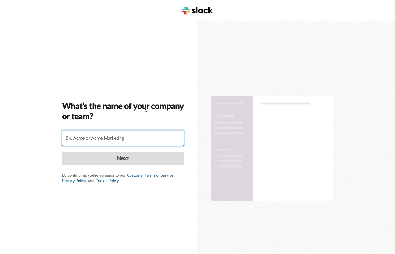
If you use this sign up flow for your SaaS, a good way to minimize the friction is by explaining the purpose of the data you’re collecting, as Slack does. It tells them how the data they’re providing is going to help, so they feel like they’re getting something in return.
Adam Fard, Founder & Head Of Design at Adam Fard’ UX, believes this model is the best because:
“People are accustomed to this method. It is conventional wisdom that human brains have pre-established mental models for how things work. Sign-up flows of this type offer additional significant advantages, like helping to keep spammers out of your app.”
Method 2 – All The Data After Providing Some Access
So, asking users for too much data before providing any access can result in unwanted levels of friction. This second SaaS sign up flow aims at minimizing the initial friction for users, and provides them instant initial access. This gives them a ‘taste’ of what they’re in for.
By allowing users a glimpse of how your product can add value to their lives, asking for their data will feel a lot more justified. This is the approach Chargebee used in their sign up flow.
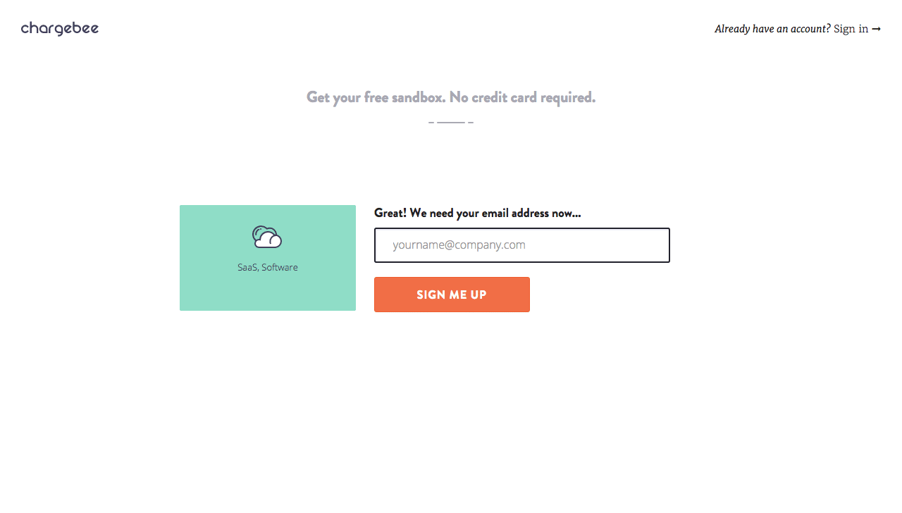
They provide immediate access to the user with just their email, only asking them to finish signing up the second time they return to the application.
Things can go wrong here too. As you offer immediate access, you’ll have to remove the steps used to authenticate their identity. Also, there is no commitment bias here; (unlike the first approach) and users may not have enough motivation to come back.
Method 3 – Instant Access, Contextual Data Collection
This SaaS sign up flow aims at minimizing user friction by making data collection as contextual as possible. It focuses extensively on user experience.
Users are offered immediate access initially, similar to the second approach. Sign up forms, even if presented at a later stage, ask for data without any context. Gradually building up a user profile each time they interact with your product is called “progressive profiling”. This approach believes that a better way is to show the users context as they use the product, and collect data with gradual engagement.
For example, the Geni website asks the user for relevant data when they try to use the functionalities which need the specific data they’re collecting. Hence, the user would be signing up “overtime” as they explore the product.
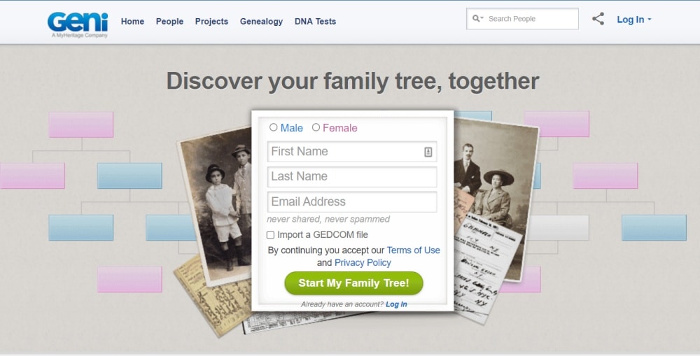
This approach, also called “lazy registration”, is friction-free from the user’s perspective. It provides them with enough context to provide data when they need to.
Alina Clark, Co-Founder & Marketing Director of CrocoDoc, is a fan of frictionless signups:
“We went with a frictionless sign-up flow because we wanted to make the sign-up process as easy as possible. Frictionless sign-up processes work for us because we can depend on our user interface to do the job for us. It also allows the product to close the sale almost on its own without our involvement. In the end, this has made our sales process more effortless.”
Lazy signups do make the process quite smooth but it has its downsides. Users are not explicitly “creating accounts” as there is no separate sign up process. As the process of data collection is gradual (and will take place in different sequences) – when does a user become “qualified” to get an account?
How to Optimize SaaS Sign Up Flows – Best Practices + Examples
1. Making Use Of Your Customer Success Tool
If you’re already using a CS software, like Custify, you can set custom Health Scores for users in Trial. This in turn will allow your sales representatives to track your customers’ engagement and satisfaction while they go through your SaaS sign up flow. Based on that info, you can then optimize the process.
Reaching out to trial customers is also a great way to take this even further. Here’s what Devon Fata, CEO of Pixoul, a UX consultancy agency, has to say:
“The single most effective way to reduce friction is to reach out to customers to make sure they’re getting what they need. It helps to have a clean, intuitive landing page and make the information collection process as painless as possible for customers.”
2. Choosing The Right Time
Timing your registration process is key to building trust with your potential customers. Asking them to sign up from the get-go can easily scare them away.
3. Explaining The Benefits Of Signing Up
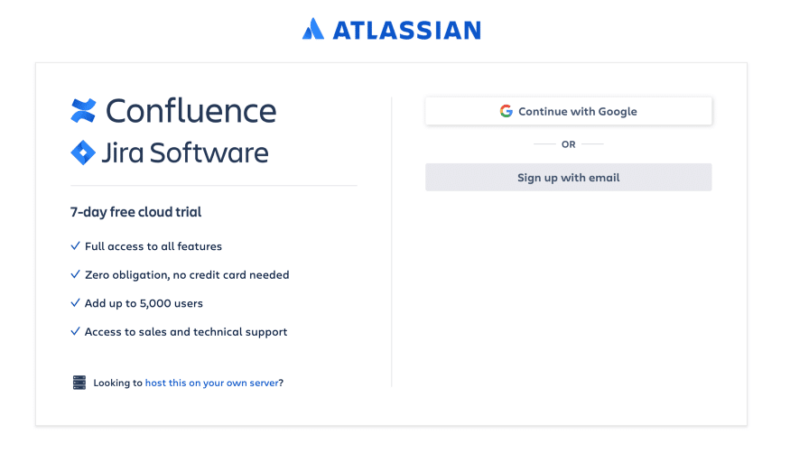
Don’t ask users to register without offering them clear reasons to do so. It’s recommended you explain what perks your users get from creating an account for your SaaS.
4. Using Informative Microcopy
Your SaaS sign up flow is dedicated to your users, so make sure you are being considerate and you’re explaining every step along the way. One way to do that is through microcopy – bits of explainer text in small font somewhere on the page. Helping them navigate the process makes their experience more comfortable and enjoyable.
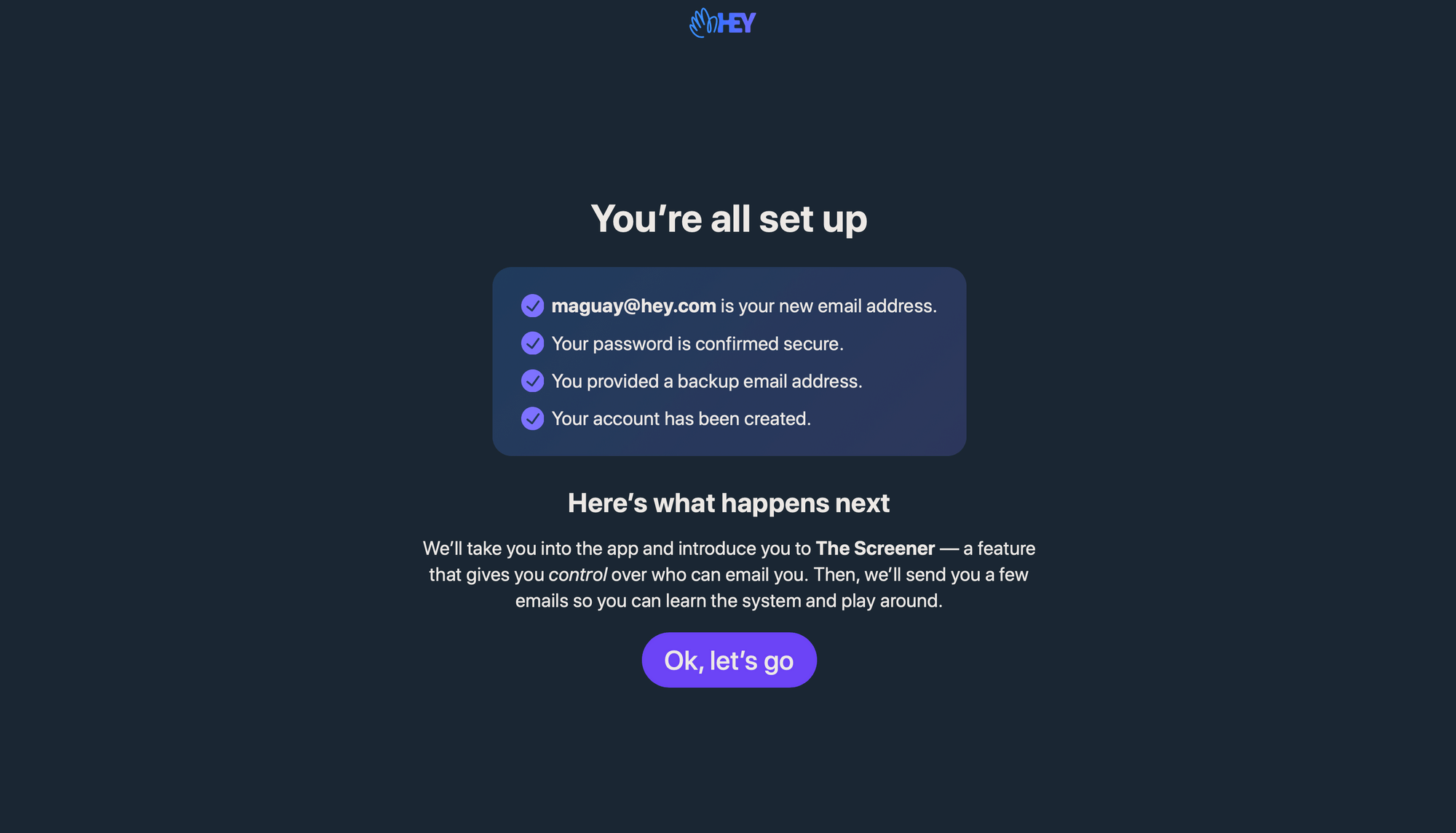
5. Keeping It Simple, Minimal, But Efficient
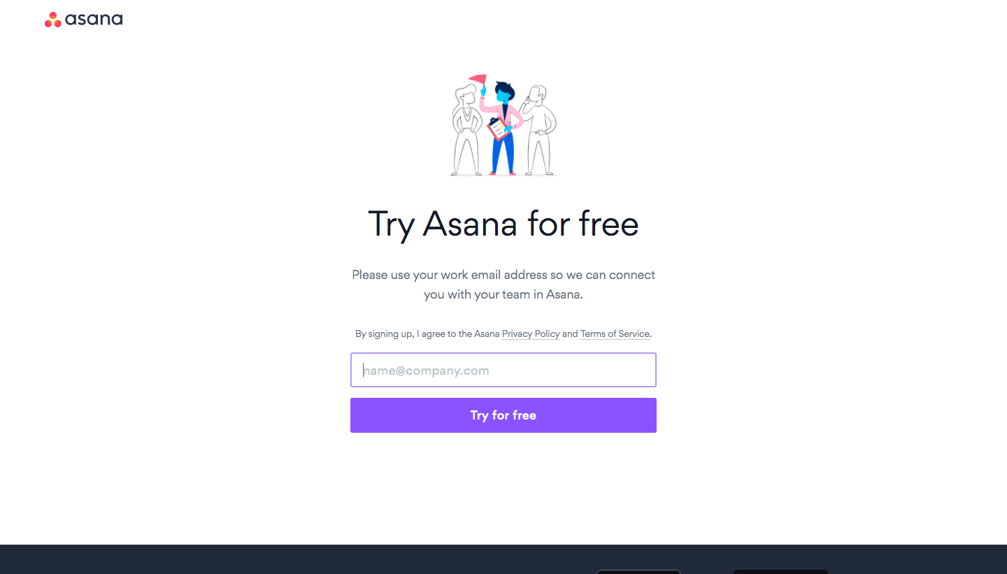
The fewer distractions your users face during your SaaS sign up flow, the better. Another great tip would be to give them answers to any questions that may rise up before they create their account. Having a “Help” button visible can be useful. Or you can add links to your Privacy Policy and Terms of Service:
6. Being Considerate Of Your Users’ Time
Here’s where lazy registration principles come in: save required sign up time and ask for additional information at a later date. This makes the process go smoothly and faster. Limiting your forms to 4 fields brings 120% more conversions than an 11 field form. That’s because the number of minutes users want to spend signing up is directly tied to how important your product is for them.
Most SaaS tools don’t fill an irreplaceable spot for their users – so unless your tool is absolutely essential to them, make sure to clock the time spent during the sign up phase & optimize it. Here are some easy tips that can easily chip away precious seconds from the process:
- Logical field order: easiest to fill moving to hardest one to fill. Once users are committed to the process, they will want to go through with it.
- A single field for “name”: no need to separate that into first name & last name.
- Optimize the field for mobile devices. There’s nothing worse than wasting time trying to fill in a form that doesn’t fit on your screen.
- Autofill all the way: typing takes time, we hate it, especially when it’s information we usually type out all the time. All your forms must support autofill & give logical suggestions whenever possible.
7. Using One-Click Registration
Giving your potential the option to sign up through a third-party social media platform like Facebook or through their Google account significantly decreases the time spent with regular registration. And you might also retrieve other valid data about your users that might have otherwise taken up more form fields.
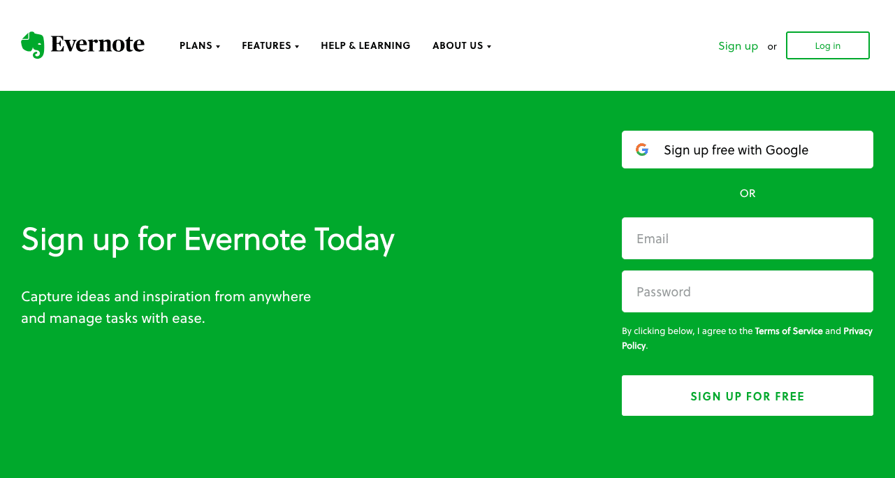
8. Providing Tips And Guidance Along The Way
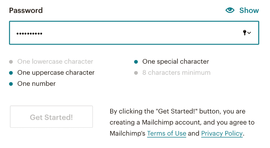
Make sure to include an example of the proper input format for your sign up flow to avoid having your potential customers guess their way through it. Here’s how Mailchimp does it:
9. Providing Anonymous Access
This way, your potential users can get a taste of the benefits you’ll be offering them without compulsory registration. Try to keep their access functionally limited, without being restricted, and next time they’re browsing your page they’ll likely be more willing to create an account.
Here’s what Brian Dean, founder of Exploding Topics, has to say on best practices for SaaS sign up flows:
How Important Is Friction in the Sign Up Process?
Although every SaaS sign up flow focuses on minimizing friction, it can play an important part in enhancing the overall user experience. This holds true in the case of companies that provide a large number of products/services and cater to a large user base.
In a nutshell:
- a friction-based flow provides your users with more added value later on but makes the registration process harder and more time-consuming
- a frictionless flow makes the registration easier, but you have to prove the value of your SaaS product from the get-go.
Therefore, if your product is too complex to demonstrate its value through the UI alone, you might want to consider a friction-based sign up flow, to make sure you collect all necessary data and push your users through all required actions for setup.
Let’s take a look at Pinterest – they use added friction in their sign up process, but it helps in return with enhancing users experience and customizing their feeds.
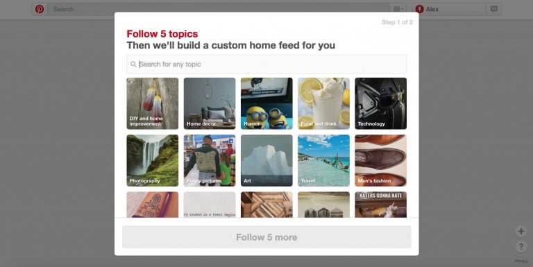
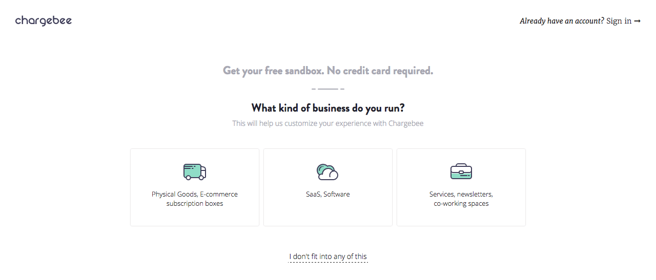
Friction can also be used to segment your leaders and serve them valuable, personalized information. Chargebee asks its users to specify which industry their business belongs to in order to serve them just the information they’re looking for:
Let the Users Flow In!
When it comes to SaaS sign up flows, there is no “one size fits all” solution. To define yours, here are some questions you should keep in mind:
- What’s your purpose? What are you trying to accomplish with it and how does each step or form field help you with that?
- Who is your target audience? Different ages/professions/ positions result in different attention spans, preferences, and ways in which people interact with software.
- Is your product optimized for your users’ behavior? Once you have put together your flow, it’s essential to improve it by tracking how users interact with it.
At Custify, we’ve developed the best customer success tool which can help you track user behavior along with KPIs to measure the performance of your sign up flow. Get in touch for a free demo today.
