Optimize UX in ecommerce

1. Make sure your CTAs are noticeable, contrast the rest of the page, look clickable, explain what happens next, and inspire users to take action.

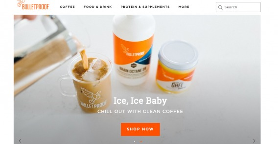
There’s a science to a good CTA, but for simplicity’s sake, ask yourself whether your CTA is clear and noticeable. For example, Bulletproof uses a clear and prominent CTA that hits all the marks. Bulletproof uses a CTA that's hard to miss, uses contrasting colors, looks clickable, explains what happens next, and inspires users to take action.

2. Offer a guest checkout option and don’t force people to register.

Forcing customers to register introduces unnecessary friction. Instead, offer them the option to checkout as a guest and create an account after they’ve completed their purchase. Consider creating an account anyway for customers who opt for guest checkout. They will enter their email and name anyway; all you have to do is generate a password and email it to them once they complete their order.

3. Use high-quality, zoomable product images that show your products from different angles and in context.

Customers can’t try products online nor can they see, feel, or experience them tangibly. A high-quality, zoomable image offers the next best thing. Ideally, use product images that show the product in use or in context. This is much more effective than a standalone product image. For example, most clothing stores, like Bonobos, use models to showcase what their clothes actually look like when worn.  Bonobos uses models to showcase what their clothes actually look like when worn.

4. Write product descriptions that give customers enough information about the product and how it can help them.

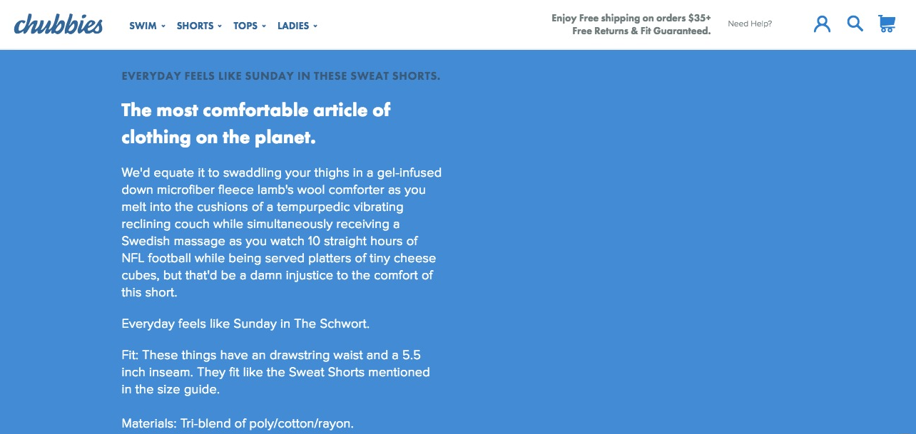
The role of product copy is to give buyers enough information to convince themselves that the product is right for them. Full, complete information makes for a much better copy than manufacturer’s descriptions. For example, Chubbies product descriptions are so good and so descriptive that they’re almost a feature of the product.   Chubbies writes product descriptions so good that they're almost a feature of the product. Additionally, consider removing social share buttons and other distractions from product descriptions. A VWO study showed an increase of 11.9% in click-through rate for the Add to Cart button when an ecommerce site removed social sharing buttons from their product pages.

5. Add a prominent, dedicated Sales or Specials section.

Studies have found that about half of online buyers would only buy discounted products, except under exceptional circumstances, and around 60% say they are looking for a section that identifies sales and specials. Prominently displaying a dedicated Sales or Specials section caters to these customers.

6. Add a subtle link that asks users if they have a promo code instead of displaying a coupon box by default.

Don’t display coupon code boxes by default, instead use a link that asks users if they have a promo code. After they click the link, a pop-up coupon code box allows them to input their code and get their discount. Whether you can add this feature depends on the ecommerce platform you use, but ask your web developer to check whether this is possible and to set it up for you.

7. Display your contact information prominently throughout your site and add a live chat option for instant support.

Most sites give shoppers the impression that they’re unwelcome by making it impossible to find answers to common questions, like return policies, and making it tough to find where to go to talk to an actual human. The easiest way to counter this is by making your contact information prominent on all pages of your site, such as by adding it to your site-wide header. Ask your web developer to add your contact information for you if you’re not technically inclined. Moreover, users like the option to use live chat to instantly resolve any questions they may have. Chat tools like Zendesk or Intercom are easy to add to your site and do wonders for user experience.

8. Add a prominent, site-wide benefits bar highlighting reasons users should buy from you and the rewards you offer.

Answer the question Why buy here and not from a competitor? and convey the value you offer and the reasoning in a site-wide benefits bar. Remind customers why they should shop with you. For example, Adore Beauty uses a simple sitewide benefits bar with a hover-over box explaining the benefits buyers receive when they shop with them.  Adore Beauty uses a simple sitewide benefits bar with a hover-over box explaining the benefits buyers receive when they shop with them.

9. Use clear progress indicators during checkout to give customers an element of control over their experience.

People like to feel like they’re in control of their experience and a progress bar lets them know things like where they are in the process, what’s coming next, and how much longer it’s going to take. For example, Crate&Barrel uses a prominent progress bar that shows where customers are in the checkout process, what comes next, and how many more steps are left.    Crate&Barrel uses a prominent progress bar that shows where customers are in the checkout process, what comes next, and how many more steps are left