Optimize forms for mobile ecommerce

1. Exclude any fields that aren’t absolutely necessary and use a maximum of 5-6 single input fields to minimize form length.

For example, condense fields like First Name and Last Name into a single Name field.

2. Use drop down boxes whenever possible for fields with more than 3 input options.

For example, use a drop down box when users select their shipping option if you offer more than 3 shipping options. Replace long dropdowns, like a list of states, with auto-complete fields that anticipate the results as users input each character.

3. Add a sticky progress bar to allow users to keep track of their process at all times.

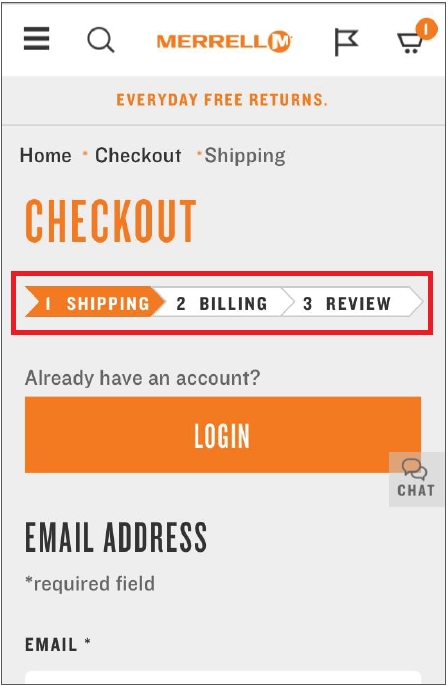
This does away with screen size constraints and lets users feel in control the whole time, thus lowering abandonment rates. Popular designs include a progress bar that fills as users complete form fields and a series of dots, with each dot representing a field, connected by one line. For example, Merrel uses a progress bar that keeps users updated on their checkout progress and clearly communicates the next steps. Merrel uses a progress bar that keeps users updated on their checkout progress and clearly communicates the next steps.

4. Use top aligned form field labels instead of inline or left aligned labels.

Top aligned labels allow users to see both the form field and label simultaneously, meaning they won’t have to pinch or scroll when filling in a form, thus lowering the risks of users forgetting what they’re supposed to be typing in. Top aligned field labels allow you to use larger form display fields since labels aren’t crammed next to them, thus improving readability.

5. Keep form field input completely visible as it’s being filled out to allow users to validate what they input and correct errors.

One way to achieve this for long fields, such as email addresses, is to determine how many characters can be displayed at once and decrease input text size by 10-20% as the user reaches 80-90% of the character limit.

6. Use a visual calendar for date form fields instead of requiring users to manually type dates in.

7. Customize keyboard displays based on the required text input and implement them consistently.

For example, automatically display the numeric keypad for phone numbers, zip codes, or credit card numbers.

8. Auto-populate fields that contain potentially repetitive information and give users the option to manually edit them.

Go through popular forms on your site, such as the checkout form, and make a list of fields that could potentially be filled in using the same information. For example, location-dependent fields like ZIP code, state, city, and country can be auto-populated based on a user’s IP address.

9. Use real-time validation to notify and allow users to correct errors.

Use conventional icons such as red Xs or green checkmarks. Use placeholders like Passwords must contain a minimum of 8 characters to increase the chances of users filling out fields correctly the first time round.

10. Add auto-advance to fields with easy-to-verify formats, like credit card number, expiry date, or phone number.