Install and use libraries in Python

1. Install the most commonly used Python libraries: Pandas, NumPy, Plotly, and Dash.

Use Pandas for analysis on data that’s in a table format. Install Pandas in your terminal: > python3 -m pip install pandas Use NumPy to quickly generate data arrays and matrices. Install NumPy in your terminal: > python3 -m pip install numpy Use Plotly – ploy.ly/python – to create charts like scatter plots, line charts, bar charts, and bubble charts. Install Plotly in your terminal: > python3 -m pip install plotly==4.14.1 > python3 -m pip install xlrd Use Dash to create full dashboards with multiple components, interactivity, and multiple plots. Install Dash in your terminal: > python3 -m pip install dash

2. Use the DataFrame() class to create and initialize DataFrames using Pandas.

The DataFrame() class syntax is: DataFrame(data=None, index=None, columns=None, dtype=None, copy=False) For example, to create and initialize a DataFrame from a list of lists, you would pass this list of lists to the pandas.DataFrame() constructor as a data argument. import pandas as pd #list of lists data = [['a1', 'b1', 'c1'], ['a2', 'b2', 'c2'], ['a3', 'b3', 'c3']] df = pd.DataFrame(data) print(df)

3. Create DataFrames by passing the Numpy array as a data parameter to pandas.DataFrame().

For example, using the code below, you can: Import the Pandas package and Numpy package. Initialize the 2D Numpy array. Use the pandas.DataFrame(numpy array) to return the DataFrame. import pandas as pd import numpy as np array = np.array([['a1', 'b1', 'c1'], ['a2', 'b2', 'c2'], ['a3', 'b3', 'c3']]) df = pd.DataFrame(array) print(df) Output: 0 1 2 0 a1 b1 c1 1 a2 b2 c2 2 a3 b3 c3

4. Create a visualization bar chart from a CSV file using Plotly.

For example, if you created a CSV file with the fields ID, Customer Name, Order Number, Order Amount, Date Ordered, and Date Delivered, you would: Call the CSV file using the Pandas library and output the sheet using Pandas. 
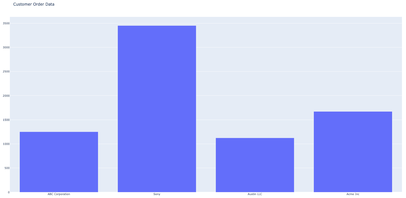
Create a bar chart using the above CSV file with Customer Name as the x-axis and as Order Amount as the y-axis. import pandas as pd import plotly.offline as pyo import plotly.graph_objs as go data = [go.Bar(x=df['Customer Name'],y=df['Order Amount'])] layout = go.Layout(title='Customer Order Data') fig = go.Figure(data=data,layout=layout) pyo.plot(fig) Web browser output:

5. Use Dash to create line charts and include parameters for users to choose their desired output.

For example, using Dash, you could import an open source library of data that consists of life expectancy by country. Next, you can create the line charts using the data and color code the output to display the life expectancy by country, and parameters for users to choose the continents: import dash import dash_core_components as dcc import dash_html_components as html from dash.dependencies import Input, Output import plotly.express as px df = px.data.gapminder() all_continents = df.continent.unique() app = dash.Dash(__name__) app.layout = html.Div([ dcc.Checklist( id="checklist", options=[{"label": x, "value": x} for x in all_continents], value=all_continents[3:], labelStyle={'display': 'inline-block'} ), dcc.Graph(id="line-chart"), ]) @app.callback( Output("line-chart", "figure"), [Input("checklist", "value")]) def update_line_chart(continents): mask = df.continent.isin(continents) fig = px.line(df[mask], x="year", y="lifeExp", color='country') return fig app.run_server(debug=True) Web browser output: