Improve error messaging

1. Make error messages noticeable and clearly explain what users need to fix.

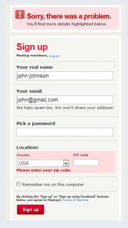
For example, this Meetup form features the error message at the very top and in a large font. It tells you clearly that the zip code needs to be entered. 

2. Allow users to edit their original input instead of making them start all over again.

For example, if an error message shows up when a user is searching for something, retain the original query term to facilitate correction.

3. Offer users a list of correct actions or fixes.

Don’t just show an error message like City and zip code don’t match. Allow users to click a button that automatically finds a city for the zip code they entered.

4. Write error messages for humans and avoid complex jargon.

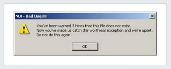
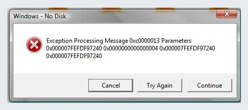
For example, avoid error messages that sound robotic or too technical, like the ones below.

5. Use light-hearted humor wherever appropriate to minimize user frustration.

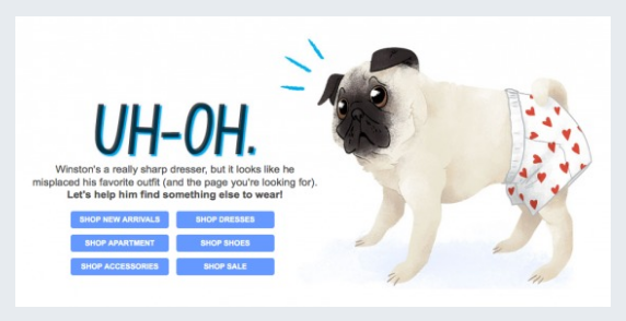
A 404 page is a great place to add some light-hearted humor and a strategic redirect, as can be seen in this example. 

6. Use inline validation to find, detect, and correct errors in real-time.

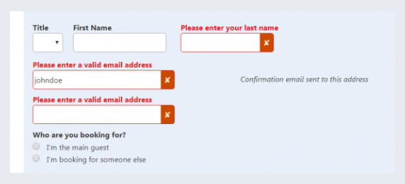
For example, this form on Booking.com shows users what they need to correct before submitting the form.   

7. Accept responsibility for the error and provide the solution instead of blaming the user.

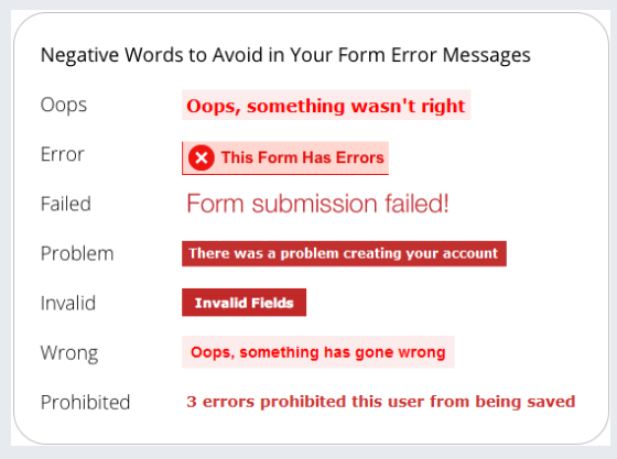
Don’t use negative or condescending language, such as the one you can see in this example. Don’t make the user think the problem is worse than it actually is. Don’t make users feel foolish as it is not their fault. Here is an example of what to avoid.