Implement best practices in form design

1. Remove useless or unnecessary form fields and only ask for essential information.

Every field you ask users to fill out increases friction, and every additional field costs you prospects. Is the additional information you gain from the field worth losing those people?  Do you really need it? Do you really need people’s phone, fax, or address? Do you need a company name if you’re selling candles?  For example, Expedia removed the Company field from their booking form and saw an increase of $12 million a year in profit. If you’re a B2B company doing lead generation and data is a concern, consider using data enrichment companies like Clearbit. Data enrichment companies can typically gather company data from basic information like first names and email addresses, allowing you to optimize your forms while still generating qualified leads.

2. Use single-column forms instead of multi-column forms to make navigation easier.

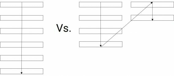
This guideline has been around for years, and in one CXL study, participants completed linear, single-column forms in an average of 15.4 seconds faster than the multi-column forms. The image below illustrates how much simpler linear, single-column forms are for users to complete.  Linear, single-column forms are much simpler than multi-column forms for users to complete.

3. Communicate errors clearly and explain how to fix them - position the messages in an intuitive location.

Don’t blame the user and write like a human, not a robot.  Don’t list all errors at the top of the page. Inline validation is a good solution.

4. Use inline validation to find, alert, and correct errors in real time.

Handling errors is all about clear expectations and communication. Instead of waiting until users complete the form, tell them what’s missing or what went wrong right away. The image below is a great example of inline validation at work, instructing users how to complete forms and making them aware of fields they’ve left out or completed incorrectly.  Inline validation can be used to instruct users how to complete forms and make them aware of fields they've left out or completed incorrectly.

5. Order form fields from easiest to hardest to fill out.

When someone takes a small step or action toward something – such as completing a purchase – they feel compelled to finish. Don’t ask for billing information or personal information right away. Wait until later, when users feel more committed and compelled to finish, to introduce friction.

6. Use features like autofill and autoformatting, combine related fields, and indicate whether each field is optional or required to make typing easier for users.

For example, users’ billing and shipping addresses are often the same, and using autofill prevents them from having to complete the same address twice. When deciding on autofills, here are some good questions to reflect on: Do you have any good defaults for this field? What’s the history available? Do you have any commonly used values? Can you use the browser of mobile features or settings to populate the field? Can you calculate the field? For example, autofill the state based on the zip code. Autoformatting allows users to enter data – particularly fields such as zip code, phone number, and credit card – any way they want and automatically fixes the formatting post-input. Ask your web developer to ensure that autofill and autoformatting features are set up on your forms.  Combine related fields (like first and last name) and indicate if each field is required or optional unless they’re all required. Ask yourself if you need to include those optional fields. Most of the time, they’re unnecessary. For example, do you really need your customers’ title or middle name? Why turn one field into four?

7. Use radio buttons instead of drop down lists and avoid the Clear fields button.

Forms with drop down lists take more time and effort to complete, and more time and effort means more friction. Drop down lists interrupt the user flow, are harder to read, and require more dexterous mouse (or finger) maneuvering. Users who fill in your form don’t want to clear the fields. If, however, they accidentally click the Clear fields button, there’s a good chance they won’t start over.

8. Don’t make coupon code fields prominent.

When people see a big Enter coupon code here field, they feel less special and wonder why they don’t have one. This makes them more likely to head off to Google in search of a coupon, and leaving the site to search for coupons is a common reason for cart abandonment. Instead of a large banner or form field, consider adding a subtle text link saying something like, Got a coupon? If the user clicks the link, it should open an input field.

9. Offer field focus on mobile devices to give users more visual control over the form.

You don’t want users to get lost in the form. Ensure the input field being edited is prominent and focused. Ask your web designer to ensure that fields being edited are front and center and not hidden by the keyboard or other mobile elements.

10. Don’t mask passwords on mobile devices.