Evaluate content performance with heatmaps

1. Choose the pieces of short-form and long-form content you want to evaluate.

Pick pieces that have similar traffic, if possible, so you have an apples-to-apples comparison.

2. Use a dynamic heatmap tool like Lucky Orange to generate a scroll heatmap of the short-form content.

A scroll heatmap shows how far down, on average, the majority of people scrolled before leaving a webpage.

3. Scroll down the heatmap to find the effective fold - where 50% of readers have left the page.

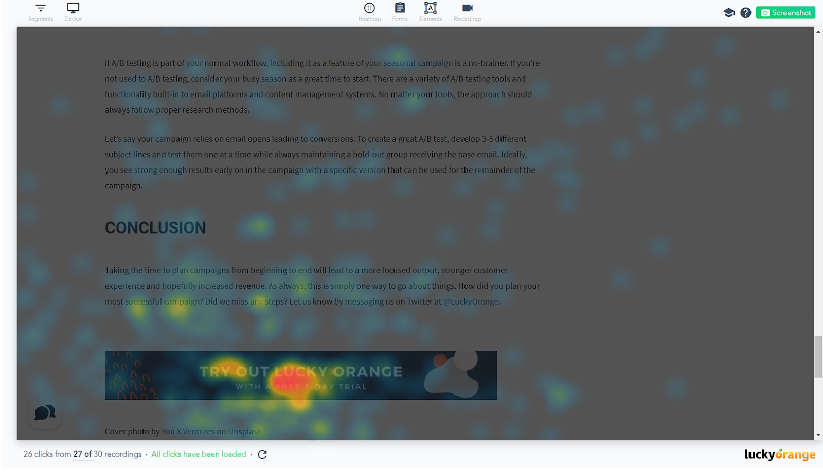
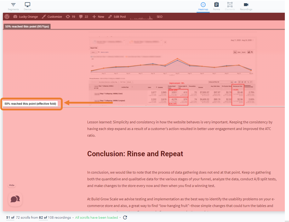
As more readers leave the page, the scroll depth color changes from darker red to lighter red.  In a scroll heatmap, you can see how far a person scrolled down a webpage. The point where 50% of readers left the page is called the effective fold and is noted on a scroll heatmap.

4. Switch to a clicks heatmap to see how many users are engaging with CTA and links in your content.

Larger red spots indicate more users are engaging with those elements. The clicks heatmap shows the call to action to start a free trial of Lucky Orange is getting the most engagement by displaying a reddish-orange overlay on the element button to denote users clicking there most frequently.

5. Repeat the process of reviewing scroll heatmaps and clicks heatmaps with a piece of long-form content.

6. Compare the performance of the short-form content against the long-form content, including effective fold and CTA clicks.

Make note of which piece had an effective fold deeper into the content. That indicates more reader engagement.  Make note of which piece received more clicks on your CTAs, and whether those clicks were at the beginning, middle, or end of the piece, or consistent throughout.

7. Repeat the process for several more pieces of short- and long-form content.

Reviewing multiple pieces ensures you aren’t making assumptions on a one piece of unpopular content.

8. Focus your efforts on the type of content that had an effective folder further down the page and that received more clicks on your CTAs.