Create a custom GA dashboard with Data Studio

1. Consult your team or examine your existing reporting habits to choose a main objective or purpose for the dashboard.

What is the purpose of this report? For example: Improve content marketing performance. Monitor site speed performance. Track ecommerce behavior.

2. In a spreadsheet, list up to 10 key performance indicators, metrics, or data points that you need to track to achieve your objective.

Prioritize metrics and data that are actionable and fundamental to your objective – they should be data that you refer to regularly. Avoid ‘nice to know’ metrics.

3. For each KPI, metric, or data point on your list, assign a chart type that will visually communicate the data most efficiently.

For example, traffic growth over time is typically displayed in a time series chart. Other chart types that Data Studio currently supports include: Tables Scorecards Bar charts Pie charts Maps Line graphs Area graphs Scatter graph Bullet chart Tree map.

4. In Data Studio, go to Create > Report, select Google Analytics under Google Connectors and add a Google Analytics View.

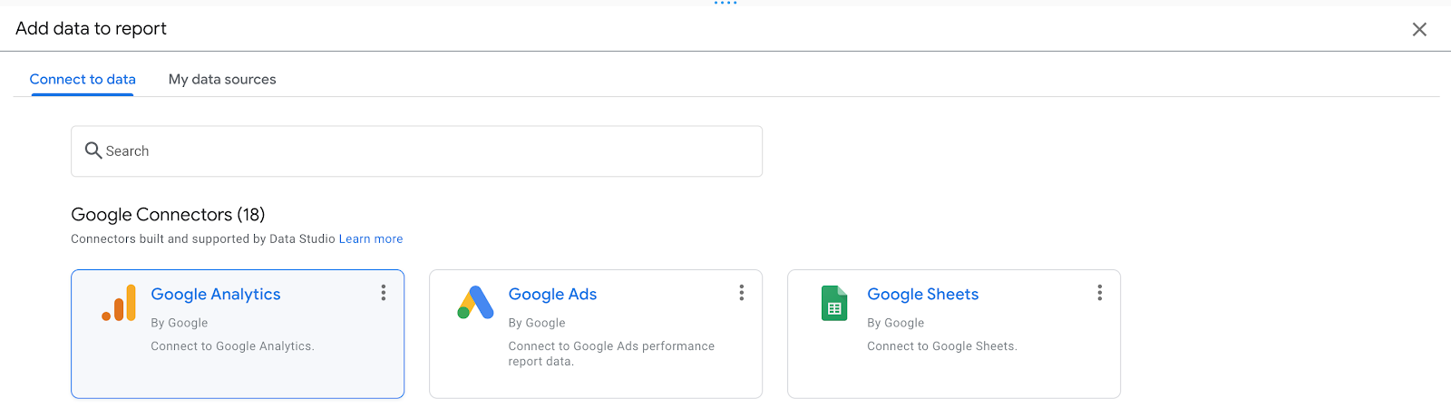
To connect multiple GA Views for your dashboard (perhaps you have a blog on a subdomain), click Add Data from the toolbar and repeat the process. Note that having three or more data sources for a single dashboard can slow down its loading time.

5. For each KPI, metric, or data point, click Add a chart, select a chart type, and configure the Data source and Metric.

If you need to combine data from multiple data sources, such as aggregating traffic from two domains, click Blend Data to combine sources. If you need a custom field type for the metric, such as combining multiple GA goals into one goal, click Add Field and use functions to create your field. Add filters or GA segments to drill down into data – for example, to display sessions from organic traffic only.

6. Arrange the charts in order of importance - most important in the top-left corner, least important in the bottom-right corner.

For example, an ecommerce dashboard will typically have revenue, number of purchases, conversion rate at the top, acquisition channels and sales funnel in the middle, and data about specific products at the bottom.

7. Make the dashboard interactive by adding controls.

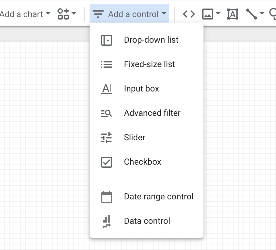
The most common control is the Date range control – this allows you to change the time frame of the data.

8. Under Theme, click Customize to change the colors and fonts to match your branding.