Avoid being deceived by data

1. Understand the most common causes of data deception.

Sometimes, people are simply motivated to prove their points, so the message gets skewed by the messenger. Data deception goes beyond misinterpreting A/B testing statistics and can occur for a variety of reasons, some benevolent and some not. Some of the few possible causes listed by Wikipedia include:  The source is a subject-matter expert, not a statistics expert.  The source is a statistician, not a subject-matter expert. The subject being studied is not well-defined.  Data quality is poor.  The popular press has limited expertise and mixed motives.

2. Verify that the sample is representative and large enough to infer accurate results.

It’s easy to be fooled by small sample size, and these often come in the form of celebratory case studies demonstrating an impressive lift. Sampling should infer answers about the whole population for the most accurate results. For example, if you wanted to discover which place in my town has the best coffee, McDonald’s or Starbucks?, you’d want to collect a representative sample large enough to infer the results of the whole population.

3. Be skeptical of unrepresentative survey samples.

Attitudinal (X percent of people say Y), in particular, are a major culprit of using unrepresentative convenience samples and small samples. For example, if you’re a coffee roaster and want to run a study to find out the percentage of the population that starts their day with a cup of coffee, sending a survey to your customers will probably reveal that “all the population” start their day with coffee.

4. Be wary of cherry-picked segments or biased samples.

Similar to unrepresentative samples, if the person presenting the data wants to make a point, they can easily pollute the samples with biased measurements or cherry pick-data to prove their point. This is also known as selection bias. Some examples of how marketers can cherry-pick samples to prove their point include: Surveying only their best customers.  Only analyzing their top cohorts.  Only highlighting top-performing segments in an experiment.  If data simply sounds weird or too good to be true, question the sampling.

5. Understand that correlation does not imply causation.

Just because two variables have a high correlation coefficient, doesn’t mean they’re related in a meaningful way, let alone causal. While correlational data can be valuable, taking correlational observations at face value can cause problems.  For example, say you have two binary variables do you drink coffee? and do you have children? After conducting research with a representative sample, you find that people that drink coffee are more likely than the average person to have children — which can be safely expressed by saying, if you drink coffee, you’re more likely to have children. However, one small change to this sentence could entirely change the meaning and infer causality, which your initial research did nothing to confirm: if you were a coffee drinker, you’d be more likely to have children. When reading a sound bite like that, many would understand it to mean you’re less likely to have children if you don’t drink coffee.

6. Be mindful of the post hoc fallacy.

The post hoc fallacy establishes a causation where there is only correlation: This happened earlier, and therefore it caused what followed to happen. For example, analytics data tends to be seasonal, so if you’re starting your work at the bottom of a peak, it’s very likely that any action will make it look like it’s increasing your metrics. This doesn’t necessarily mean that the action caused the increase, however.

7. Watch out for outliers in a data set that can skew averages.

A frequent example of this is with average salaries. Since salary tends to be a metric that doesn’t fall on a normal distribution, a few people making a ton of money can skew the average. This also applies to A/B test results, particularly when optimizing for metrics like average order value or revenue per visitor. For example, if most customers in a data set spend $30-40, but a few spend $200-300, including those that spend $200-300 will artificially inflate the average order value.

8. Watch out for misleading charts and data visualizations.

Data visualizations tend to be a primary source of confusion and misrepresentations of reality. Oftentimes, it’s simply inept, and you end up looking at convoluted charts that mean nothing to anyone except the analyst. Other times, however, misleading graphs can be purposefully propelled to fulfill ulterior motives. Some of the worst offenders include: Pie Charts are hard to read, can easily distort proportions, and are almost universally derided by analysts. Portions of the pie can be made to appear the same size, even though one is actually much smaller in terms of quantity.  
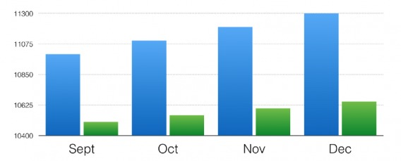
Cropped Axes can make the difference between two data sets look much larger than it actually is. For example, the y axis for the first chart below starts at 10,400, while in the second chart it starts at zero. Huge difference, right?  Truncated chart showing the Y axis starting at 10,400.
The same chart showing the Y axis starting at zero.